
I incorporated the fox tail into the T to keep the traditional flow with the text so it wouldn't offset the text from the image. I stayed with two colors; red and black, which was the original colors chosen.

Instead of mixing the tail in the script T, I added it to the word "VIXEN" as a vixen is a female fox and it would connect the brand to the understanding. I added another color; gold and changed the color scheme of the text.

Keeping the same design as before, I changed the fox tail from gold to glitter as some of her eyeshadows are glitter-based.
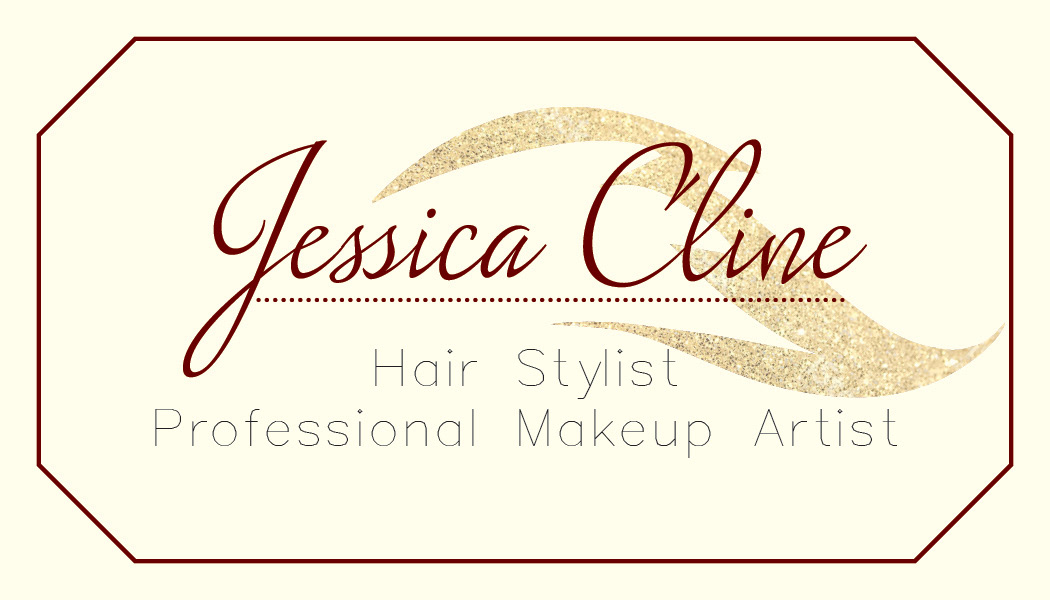
Front of the first business card idea - I used the gold tail as an accent behind her name to link her name to the company.
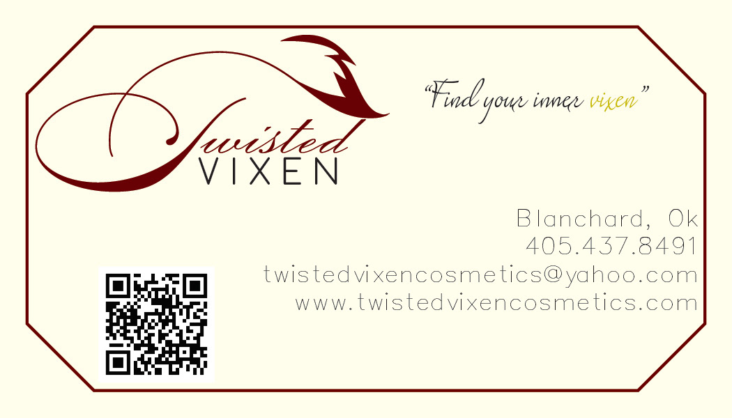
Back of the first business card - For the border, I used the same red octagon as the front, which placed the information a little higher.

Front of the second business card - Same cover as the first business card.

Back of the second business card - By removing the octagon, I rearranged the text and QR Code to open more space.
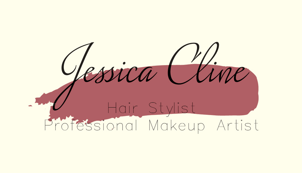
Front of the third business card - Veering away from the first two designs, I added a lipstick swatch behind her name to connect makeup to the clients name.
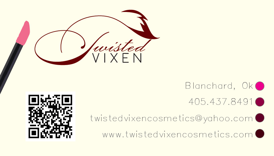
Back of the third business card - To link the lipstick swatch, I added a lipstick brush as well as use "eyeshadow" containers as bullet points for the information.